In summary:
- Focus on improving movement flow (‘movement choreography’) rather than just installing features.
- Prioritize small, high-impact ‘hacks’ like offset hinges and flooring transitions to reclaim inches and prevent falls without major construction.
- Use furniture layout, smart technology, and ergonomic positioning to reduce daily physical strain and enhance independence.
- Choose solutions based on speed and reversibility, especially in urgent situations like hospital discharge.
The charm of a Victorian terraced house—its high ceilings, period details, and solid construction—is undeniable. Yet, for many owners, this charm comes with a significant challenge: narrow hallways, tight turns, and multiple levels make them notoriously difficult to navigate as mobility needs change. The default solutions often seem drastic and expensive: installing a stairlift that clutters the staircase, or embarking on a costly, disruptive rear extension. While grants can sometimes help, the core problem remains a puzzle of space and budget.
Many homeowners believe they face a binary choice between moving or spending a fortune. This often stems from a misunderstanding of what creates a truly accessible home. It’s not always about adding more space, but about making the existing space work smarter. The conventional approach focuses on installing equipment, but a more effective strategy lies in re-engineering the very flow of movement within the home, a concept I call ‘movement choreography’.
But what if the key wasn’t in brute-force construction, but in a series of clever, targeted interventions? What if you could reclaim precious inches, eliminate daily frustrations, and dramatically improve safety with creative, budget-conscious solutions? This guide moves beyond the obvious to reveal an architect’s perspective on adaptive reuse. We will explore how to analyze your home’s layout, identify the most critical bottlenecks, and implement practical, cost-effective modifications that respect both your budget and your home’s unique character. From the floorboards up to the light switches, we’ll uncover the secrets to transforming a restrictive layout into a space of freedom and independence.
This article provides a detailed roadmap for these intelligent adaptations. Below is a summary of the practical, room-by-room strategies we will cover to help you optimize your home’s layout for safety and ease of movement.
Summary: Adapting Your Victorian Home for Better Accessibility
- Why knocking down the hallway wall improves safety for walker users?
- How to widen internal doors to 800mm without moving load-bearing studs?
- Sofa vs Armchair: which layout prevents tripping in a small lounge?
- The flooring mistake that traps wheelchair wheels and causes falls
- Where to reposition plug sockets to avoid bending down painfully?
- Brick extension vs Modular Pod: which is faster for urgent hospital discharge?
- Top loader vs Front loader on a plinth: which saves your back?
- Where to position grab bars in a small bathroom to maximize leverage?
Why knocking down the hallway wall improves safety for walker users?
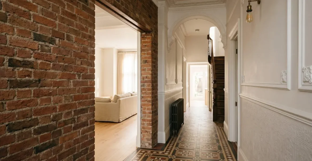
The classic Victorian hallway is often the first and most significant barrier. Narrow and unforgiving, it creates a pinch point that makes navigating with a walker or wheelchair a constant, stressful challenge. The issue isn’t just width, but the lack of a ‘turning circle’—the space needed to change direction without complex, multi-point turns. These tight manoeuvres dramatically increase the risk of catching a wheel, losing balance, or scraping knuckles. It’s a daily battle against the architecture of the home, a reality underscored by the fact that only 9% of homes in England have even basic accessibility features, according to government data.
Removing a non-load-bearing hallway wall to create an open-plan living area is one of the most transformative changes you can make. This isn’t just about aesthetics; it’s a fundamental safety upgrade. By eliminating the corridor, you replace a restricted linear path with a wide, open field of movement. This allows for a smooth, uninterrupted ‘desire line’ from the front door to the main living space. For a walker user, it means they can move with confidence, see their path clearly, and have ample room to turn and reposition. For a wheelchair user, it can be the difference between dependence and independence, as highlighted by the experience of Mike Nevin, who found his inaccessible Victorian home left him ‘technically homeless’ until he moved to a property with wide, open access.
The ‘cost’ of the wall is far outweighed by the ‘value’ of the space it frees up. The improved sightlines enhance feelings of safety and connection to the rest of the home, while the increased natural light from the front room flooding the entranceway makes the entire space feel larger and more welcoming. This single, relatively low-cost structural change initiates the critical first step in successful movement choreography: creating a safe and generous entry point.
How to widen internal doors to 800mm without moving load-bearing studs?
Once you’re past the hallway, the next obstacle is invariably the internal doors. A standard Victorian door opening of around 700-750mm is simply too narrow for comfortable wheelchair access and can be awkward even with a walker. The conventional solution—moving load-bearing studs and installing a new, wider lintel—is a messy, expensive, and structurally significant job. However, as architects, we look for ways to achieve the goal without resorting to brute force. The key is to focus on gaining ‘usable clearance’ through clever hardware and minor modifications, a philosophy of reclaiming inches wherever possible.
Before you call the builders, there are several highly effective, low-disruption techniques to consider. The most ingenious of these is the installation of offset or ‘swing-clear’ hinges. These special hinges pivot the door in a way that swings it completely clear of the doorway, instantly adding 1-2 inches of usable width without a single speck of plaster dust. For rooms where privacy is not paramount, such as the opening between a lounge and dining area, removing the door and architrave entirely to create a clean, cased opening can be the simplest and most effective solution. Another trick is to simply re-hang the existing door to swing outwards, which dramatically improves manoeuvrability inside a cramped room like a bathroom or WC.
This image demonstrates the subtle but powerful mechanics of an offset hinge.
Notice how the hinge design moves the entire door out of the frame, creating valuable extra space. This is a perfect example of how a small, targeted investment in the right hardware can provide a better result than a large, expensive structural change. Before spending any money, however, a ‘Path of Travel’ audit is essential to identify the single most problematic doorway and focus your efforts there first. This prioritises impact and budget.
Your 5-Step Home Circulation Audit
- Map the Path: Draw a simple floor plan and trace the primary daily routes—bed to bathroom, kitchen to lounge, front door to sofa. This is your ‘path of travel’.
- Identify Bottlenecks: Walk the path with a measuring tape. Note every doorway width, narrow corridor, and tight corner. Circle the top three ‘pinch points’ that impede flow.
- Assess Transitions: At each threshold, check the flooring. Is there a raised strip? Does a rug’s edge catch? Note every potential trip hazard or wheel-trapper along the path.
- Test the Ergonomics: Mime daily actions along the path. Where do you need to bend for a socket? Where do you need to reach for a light switch? Where would support from a grab bar be most useful?
- Prioritise for Impact: Review your notes. The goal isn’t to fix everything at once. Identify the one or two changes (e.g., one offset hinge, one threshold strip) that would solve the most critical bottleneck on the most-used path. This is your starting point.
Sofa vs Armchair: which layout prevents tripping in a small lounge?
In the typically compact Victorian lounge, furniture choice isn’t just about style; it’s a critical safety decision. The wrong layout can create a domestic obstacle course, while the right one facilitates smooth, safe movement. The central debate often comes down to a large, single piece—the sofa—versus smaller, more flexible units like armchairs. While a sofa seems space-efficient, it often creates more problems than it solves in an accessibility context.
A large sofa is an immovable block. It creates long, fixed ‘walls’ of furniture that dictate narrow, inflexible pathways. This forces a user with a walker or cane to navigate tight channels between the sofa and a coffee table or fireplace, increasing the risk of tripping or collision. Furthermore, the low seating position and soft cushions of many sofas can make the act of sitting down and, more importantly, standing up, a significant physical challenge requiring immense effort and creating a risk of falls.
A layout using two or three well-chosen armchairs offers far superior movement choreography. Armchairs are modular. They can be positioned to create wide, clear pathways that can be easily adjusted. This flexibility allows you to design the ‘path of least resistance’ through the room. Opt for armchairs with a firmer seat, a slightly higher seat height (around 45-50cm), and, crucially, sturdy arms. These arms aren’t just for resting; they become functional levers, providing ergonomic leverage for the user to push up from a seated position safely and with less strain. By replacing one large, static object with several smaller, strategic ones, you transform the room from a hazard zone into a highly functional and safe living space.
The flooring mistake that traps wheelchair wheels and causes falls
The most dangerous accessibility hazard is often the one you notice the least—until it’s too late. It’s not the staircase or the narrow door, but the tiny change in floor level between two rooms. In a Victorian house, these transitions are everywhere: a metal strip covering the join between kitchen vinyl and hallway carpet, or a thick wooden threshold under a door. For a wheelchair user, these seemingly minor bumps are traps. A front caster wheel can easily get stuck, causing an abrupt, dangerous stop. For someone with a walker or an unsteady gait, they are a primary trip hazard.
The mistake is assuming all transitions are equal. A high-profile strip, even one just over a centimetre high, can be a major barrier. The goal is to create a seamless surface. While official guidelines for public spaces suggest a maximum transition height of 1/2 inch (12.7mm), in a private home, the ideal is as close to zero as possible. This means replacing those old, chunky thresholds with modern, low-profile ‘feather edge’ strips that create a gentle, almost imperceptible ramp between surfaces.
This detail shot shows the difference a purpose-designed transition can make.
The choice of flooring itself is also critical, especially on the suspended timber floors common in Victorian homes. Floating laminate or engineered wood can ‘lift’ at the edges over time as the subfloor moves, creating new wheel-catching lips. A glued-down Luxury Vinyl Tile (LVT) is often a superior choice, as it remains perfectly flat and stable. For those wishing to preserve original floorboards, ensuring all gaps are filled and the surface is perfectly sanded and sealed is a non-negotiable first step before any covering is applied. Finally, consider vision: a matte, light-coloured finish is far safer for those with age-related visual impairments than a high-gloss or busy pattern that can cause disorientation and mask hazards.
Where to reposition plug sockets to avoid bending down painfully?
Accessibility isn’t just about moving from room to room; it’s about being able to comfortably and independently interact with your environment. One of the most common, and literally painful, daily frustrations is the location of plug sockets. Traditionally placed just above the skirting board, they require a deep, often painful, bend from the waist or knees. For someone with back pain, arthritis, or limited mobility, the simple act of plugging in a vacuum cleaner or a phone charger becomes a dreaded chore.
The solution is to rethink socket placement from an ergonomic perspective. The principle is simple: bring the power up to the user. The most comfortable and accessible height for sockets is between 900mm and 1100mm from the floor. This is the same height as standard kitchen worktop sockets, a height that has been long-established as convenient for most adults without requiring bending or stretching. When rewiring or renovating, instructing the electrician to raise key sockets to this height is a small change that delivers a huge improvement in daily quality of life.
Beyond raising every socket, a more strategic and budget-conscious approach is to create dedicated ‘Charging Stations’. By installing a single panel with four or more sockets at waist height in a convenient location (e.g., in the hall or lounge), you create one central point for all frequently charged devices like phones, tablets, and medical equipment. For existing sockets that are difficult to access, smart plugs are a game-changing, non-invasive solution. Paired with a voice assistant like Alexa or a simple remote control, they allow lamps, radios, and other appliances to be switched on and off without ever touching the socket itself. This provides full control with zero physical strain, a perfect example of using technology to enhance ergonomic leverage.
Brick extension vs Modular Pod: which is faster for urgent hospital discharge?
Sometimes, the need for an accessible ground-floor bedroom and bathroom is not a gradual plan but an urgent necessity, often triggered by a sudden illness or a hospital discharge date. In this high-pressure scenario, the traditional route of building a brick-and-mortar extension is often unworkable. The timeline, from architectural drawings and planning permission to the months of on-site construction, is simply too long. This is where creative, modern solutions like modular pods come into their own, offering a radically different approach focused on speed and minimal disruption.
A modular pod is a self-contained, factory-built accessible bedroom and wet room. It is constructed off-site in a controlled environment and then delivered and craned into your garden, connecting to the main house typically through a new opening or link corridor. The primary advantage is speed. While a brick extension involves months of dust, noise, and disruption inside your home, the on-site work for a pod can be completed in a matter of days. This is a critical factor when facing an urgent need for post-hospital care.
The following table breaks down the key differences, highlighting why a modular pod is often the superior choice when time is of the essence. It also reveals other benefits like cost transparency and reversibility, which can be important for preserving the long-term value and flexibility of your property.
| Factor | Brick Extension | Modular Pod |
|---|---|---|
| Internal disruption | Months of dust, noise, builders trekking through existing home | Only days of on-site disruption—built off-site and craned in |
| Planning permission | Standard permanent building consent required | Sometimes classified as temporary structure, potentially simplifying process |
| Cost transparency | Hidden costs common (drainage re-routing, foundation issues) | Fixed all-inclusive price from manufacturer |
| Reversibility | Permanent change that may not appeal to future buyers | Can often be removed and resold, returning garden to original state |
While a pod may not have the same aesthetic integration as a traditional extension, its practical benefits in a crisis are undeniable. It provides a safe, fully-equipped, and immediate solution, allowing a loved one to return home from hospital to a suitable environment without delay. For more information on the trade-offs, a comparative analysis from property experts can be enlightening.
Key takeaways
- True accessibility is about ‘movement choreography’—designing the flow of movement, not just installing equipment.
- Small, strategic interventions like offset hinges and low-profile thresholds often provide more value than large, expensive projects.
- Ergonomics are paramount: consider how a person physically interacts with everything from furniture to sockets to reduce daily strain.
Top loader vs Front loader on a plinth: which saves your back?
The utility room or kitchen corner where the washing machine lives can be a zone of significant physical strain. Bending down to load and unload a standard front-loading machine, even one raised on a plinth, can be a painful task for anyone with back issues. It requires deep spinal flexion and reaching into the back of the drum. As an architect focused on ergonomics, I often advise clients to look beyond the UK’s default choice—the front loader—and consider the profound benefits of a top-loading machine.
A top loader completely changes the biomechanics of doing laundry. The loading motion is a simple, gravity-assisted slide from a basket held at waist height. There is no bending, no deep reaching—just a gentle transfer of clothes. This simple change in orientation provides immense ergonomic leverage, protecting the back from repeated strain. Furthermore, in the context of a narrow Victorian scullery or kitchen, a top loader is a master of space. It has a zero-door footprint; the lid lifts up, never blocking the precious circulation space in front of the machine, unlike the wide-swinging door of a front loader which can completely obstruct a narrow passageway.
There’s another hidden benefit specific to older homes. The high-speed horizontal spin of a front loader can cause significant vibration and noise on the suspended timber floors common in Victorian properties. The vertical axis spin of a top loader is inherently more stable, leading to a quieter and less disruptive wash cycle. While top loaders have historically been harder to find in the UK, their ergonomic superiority makes them worth seeking out. The table below summarises these crucial, often-overlooked differences.
| Factor | Top Loader | Front Loader on Plinth |
|---|---|---|
| Loading motion | Slide laundry in from basket at waist height using gravity—minimal spinal flexion | Requires bending to reach back of drum even on plinth |
| Door footprint | Zero door footprint—no space obstruction | Open door can completely block narrow Victorian utility room or kitchen |
| Vibration on suspended floors | Vertical axis spin creates less structural vibration on Victorian suspended timber floors | High-speed horizontal spin causes significant vibration on suspended floors |
| Alternative option | N/A | Washer-dryer drawer installed at waist height—small capacity but perfect ergonomic no-bend solution for single person |
As this guide to accessible homes points out, rethinking everyday appliances is a cornerstone of creating a truly livable space. For single-person households, a washer-dryer drawer installed at waist height offers another excellent no-bend alternative, albeit with a smaller capacity.
Where to position grab bars in a small bathroom to maximize leverage?
Nowhere is the principle of ‘movement choreography’ more critical than in the bathroom. This small, often slippery space is where the risk of a fall is highest. Grab bars are the obvious solution, but simply scattering them on the walls is ineffective and can even create a false sense of security. Effective grab bar placement is a science; it’s about anticipating movement and providing ergonomic leverage at the precise moment it’s needed most.
The guiding principle is to focus on ‘transitions’, not just locations. The highest-risk moments are the movements between states: from standing to sitting on the toilet, from sitting to standing, and the complex sequence of stepping into and out of a bath or shower. A grab bar should be positioned to assist the specific push/pull mechanic of that exact movement. For the toilet, this means having a bar to one side that you can use to lower yourself down and, more importantly, to push or pull against to get back up. The ideal height for this side bar is between 33-36 inches from the floor to provide optimal leverage for an average adult.
In a small Victorian bathroom, space is at a premium. This makes angled grab bars often superior to single horizontal or vertical ones. A bar installed at a 45-degree angle offers a range of grip heights, accommodating the user whether they are pulling up or lowering down. Another critical but often overlooked detail is contrast. A chrome grab bar on a white tile wall is incredibly difficult for someone with poor eyesight to locate quickly in a moment of need. Always choose a colour that contrasts sharply with the wall behind it. For ultimate safety, consider a continuous handrail system that follows the ‘safe zone’ of the bathroom, allowing a user to maintain a constant, supportive grip as they move between the sink, toilet, and shower, eliminating any risky ‘lunge’ between isolated bars.
By implementing these creative, budget-conscious strategies, you can transform your Victorian home from a source of daily obstacles into a haven of safety, comfort, and independence. The next step is to conduct a simple audit of your own home to identify the most impactful changes you can make today.